Wednesday, June 13, 2007
A Semester in cyberspace...
Hard to believe assessment 2 is actually upon us, it felt like only yesterday I was on class being marked on the first assessment, but I guess thats because it was at the start of this term as apposed to the end of last term. I have to say if there's one thing I'm glad to have learnt more than anything in this subject its how handy html is. I mean I know its been around for a while but I can't stop using links in everything I put on the net now, I don't know why I find it so cool. This isn't to say that I haven't stunbled accross anything else cool, but for me learning basic html was a standout.
The first thing one might notice about my blog is how its changed, oh yes I went to work on it, and I think it looks quite good. The light blue and white colour scheme is something I've been cooking up for a while as I'm big fan of these too colours together. Ofocurse being the monkey house I had to refer back to my theme so I layed an image of cartoon monkeys onto the background. A few adjustments here and there and overall I'm pretty happy with the look and layout of my blog however I'm sure it will evolve in future. One thing I've concentrated on throghout the semester on my blog is to make the posts as colourful as possible, by way of pictures and how they complement the text. A colourful picture can enhance the reader's appreciation of a post as apposed to one with just text. Its also important to incorporate the picture into the text. Some posts the picture was wedged between the text such as here and in others it was amongst the text such as here. I think consistency is an important thing in blogs so I tried to keep a similar format for each post that I made, the most obvious being my top ten film list. Every entry had its postion, name and year released as the post title followed by a picture, then the text, then a video link. I tried to give each entry atleast three paragraphs, any less wouldn't have been substantial enough and any more would've of turned away the casual reader. Even if all reader's looked at were the pictures and maybe the video links at least the post has attracted some attention, if they'd read the actual text in the post then that would be a bonus.
Regretably I didn't get to spend as much time on my flicr as I would have liked but during the term I got to put up some good snapshots dealing with website aesthetics, not only did this introduce me to the some cool sites thanks to technorati's top 100 but it also taught me a thing or two about what makes a web site look good. I'm still yet to find this thing which I assume is another account I would have to sign up for. I think the site that I most wish my blog looked like is this one. This semester has been all about community and interactivity with other peoples web identitys and probably the best interativity that I had with others was sharing pictures with Flickr. It was just so cool to be able to find pictures that others had shared from say a concert which you were at also and compare their photos to yours. I found flickr accounts of very gifted photographers and some photos I even favourited such as this one. Organisation is very important in Flickr as the vistor wants to be able to navigate through what they are most interested with the greatest of ease and this is where sets comes in handy. Unfortuntely the free version of Flickr only lets you have three sets but it was fun while it lasted I guess. Labelling sets with short, concise titles as well as giving a good background information on what the set is all about does't hurt either. Here's my favourite set that I made this semester. Flickr has opened out a whole new world in image browsing for me especially for band photography, I will continue to upload many more photos of my own as well as scour Flickr for as many other gems as I can.
Del.ici.ous is something I never saw the point of, I mean saving bookmarks is what my firefox browser is for right? Well yes but the whole point of del.ici.ous is to share your bookmarks with others, once I worked this out I acknowledged Del.ici.ous as being a very helpful tool for internet browsing. Whenver I came across a link that I thought someone else might like I saved it for them and quite often I would have links saved for me. Sometimes you'll come accross somoenes whos saved you a really popular site that only a person living under a rock wouldn't of heard about (can you believe people bookmark google?) but most of the time I stumble across interesting and helpful sites which I never even knew existed. I've been lost for hours on going from one bookmark to another. Bundles also make things a whole lot easy as I found out the hard way, you see I didn't start bundling my tags until quite late in the game so it took quite some time to categorise all my links into several helpful headings. I'm going to work more with delicious in the future as I don't think I've quite taken full advantage of its abilities just yet.
I can't see myself simply walking away from the online community I've created this semester, not only would it only render all the work I have done this year useless but it would prevent me from getting the most out of the internet. Which has a LOT to offer, thats for damm sure.
Labels:
delicious,
Flickr,
MPI104-2007,
the Monkey House
They came, they saw, they never came back...
Its been roughly 2 weeks since I joined up to sitemeter after my last visiter counter failed to impress. The results that I've been getting back have been a lot more detailed than I could of imagine. For example, apparentely the average time people spend on my blog is just 1 minute and fifty five seconds. Thats an incredibly short amount of time considering the amount of time I've spent tweaking this baby. I doubt 2 minutes isn't even long enough to read even one of my posts, but I guess it goes to show do people do a lot of quick skimming on the web and they're not always going to stop and have a good look around if there's nothing that grabs their attention straight away.
I've had a tolal of 25 visits with a further 70 page views and an average of 2 visits per day. Pretty dissapointing I reckon, but when you take into account I had 114 visitors before I joined up to sitemeter I really don't seem like such a loser. Granted my last counter was a little dodge but whos gonna figure that out? Unless ofcourse they read this post....
Sunday, May 27, 2007
What a Grind....
Just after I finish with one rant about the questionable decisions of film studios another rant begins. This time I'm airing my frustrations at the decision by god knows who to release the double feature splatter extravaganza Grindhouse as two seperate films in Australia. I mean as if it wasn't bad anough that Grindhouse was coming out a good five months after the U.S. release, we now have to wait for an inferior product as the directors in no way intended originally. The newly seperated films will also come out at different dates, forcing australian audiences to wait even longer to see both of them.
The decision has obviously been made after the poor box office that Grindhouse recieved in America, and naturally instead of giving the film a chance with audiences over here, the studios would rather take the safer option, so even if the films do poorly atleast the will have double what they would of had. Half the attraction of this Grindhouse project was the fact that it was a double feature and it even had fake ads and traliers inserted into the intermission, and now we might not even get these extras thanks to the new format of release. What can you do? Studios can make whatever decisions they want and the cinema viewing public just have to wear it and fork up the money, and at any rate, Australian's have gotten used to paying for America's mistakes.
Labels:
films,
Grindhouse,
movies,
MPI104-2007,
Rodriguez,
Tarantino
Blogger Post 22: Failure of the Franchise
This is not so much an angry post, its more of a sad one. The thoughts about to be expressed by myself haven't simply come out of nowhere, they've been developing over time and they relate to that popular form of entertainment known as the film franchise. Ths summer blockbuster has been an annual event ever since the success of Jaws oh so long ago. Every year in America the summer period is littered with all the BIG movies that this year has to offer, its not to say that all blockbusters come out during this time but a fair majority of them do in order to keep the country's population occupied whilst on their long holidays. More and more we are seeing sequels pop up during this summer blockbuster period and franchises have become a permanent fixture of the cinema landscape as we know it today.
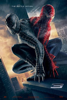
I'm not saying that there's anything wrong with franchises, I love my event films and usually no matter how bad the reviews I will still go and see a movie if its one I've been excited about for a long time. Two recent films however, Pirates of the Caribbean 3 and Spiderman 3, have confirmed a fear that has been growing in me since this whole franchise thing started. This fear relates to the pressure put on filmmakers by studios who want as many films made from the one franchise as possible thus maximising their profit as much as possible. Both Spiderman and Pirates of the Caribbean end ambiguously and in such a way that if the intention was put fourth to make another entry in the series it could easily be done. So despite the fact that studios advertise these films as the last in the series they end up being just another entry. Long,overblown ones at that.
It's up to the filmakers to take a stand against this kind of thinking as it stops a film from being a full story and rather one which never really ends satisfactorily in the hope that someone will pick up the pieces and provide the prospect of even more money. Both Gore Verbinski (Pirates director) and Sam Raimi (Spiderman 3) have refused to rule out sequels to their films and its a little dissapointing to hear that neither of these guys can admit that they intended their film to be the last of a story. If studios insist on dreching us with sequels the least they could do is think of their audiences as more than just a source of income.
Tuesday, May 22, 2007
Technorati!
Technorati, as joh has pointed out on the metablog, is commonly defined as a search engine for blogs but it is also capable of letting the user save favourites where he/she finds them. This feature is kind of like saving bookmarks in delicious but its more of a network for just blogs. I joined up to Technorati earlier this month and have so far gained an authority of 7 which is simply the number of times my blog is linked to by others. My rank at this present time, which is a measurement in terms of where my blog stands in terms of popularity with all the other blogs, is currently sitting at 704,172. I defintely have a long way to go to reach number 1 and somehow I don't think I will do it before the end of semester...or indeed before I graduate.
Form and Content
I will now attempt to tackle the subject of form and content in a blog, whilst both are of equal importance, form is something that can significantly improve a blog even if the content is of a low quality. Aesthetics is a word being thrown around a lot in class at the moment and my interpretation of this word is the level at which the item is pleasing to the human eye. Crusing around the net I discovered that one site defined the word aesthetics as something with an artistically beautiful or pleasing appearance. This definition matches pretty well with my own definition of the word and aesthetics is something which I constantly strive for on my own blogger.
In my opinion a blog or website is less likely to be viewed if it is unnatractive on first appearance. A web site for the band MUSE is one which consistently catches my eye due to its innovative design and straight away this raises the appeal of the band despite whether the person visiting the page has heard any of their material. Its font and colours complement each other perfectly and the way in which the page loads immediately catches the eye in an ultra smooth fashion. I'm a big fan of simplicity in web pages, if a page looks good without having an abundance of information then its gone a long way to impressing me. A good example of this can be made by comparing the google and yahoo pages. Both are similar websites content wise but yahoo is far more cluttered looking than google, causing much confusion when attempting to perform a simple search. For this reason I think Google not only looks better but its simplicity wins me over.
Some also importatant factors in web design are the legibility of the content: it is important to ensure the background colour is picked to enable to viewer to read the text with the greatest of ease. Another factor is the bandwidth of the user visiting the page: A page that has too much different types of media that takes a while to load is going to infuriate someone using a lower bandwidth and thus detract them from visiting the page again. Media on the net is different from print media becuase its interative, in a book you turn to a specfic page to find what your after using the index, on the net you simply click on the link that relates to what you want to see and you are taken there almost straight away. This interactive quality highlights the importance of easy navigation in a website, a user must be able to find what they are after with the aid of headings and sub-headings.
At the end of the day a good web site is something that is not only nice to look at but offers you things that print media can't. It reminds you why we use the internet.
Labels:
content,
form,
google,
MPI104-2007,
muse,
the Monkey House,
yahoo
Sunday, May 13, 2007
Crazy Techo Talk
What exactly is a feed? I used to see these crazy symbols at the bottom of web pages talking about rss feeds and all this kind of business and I chose to ignore them, now I see how they can greatly enhance your appreciation of the net.
XML or Extensible Markup language is a part of this whole thing becuase its yet another aspect of web use that I haven't known anything about until now. It seems to me as though its a more intelligent version of html, which for a while now has been the code of choice when surfing the information super highway. Although I'm still attempting to get my head around the whole XML thing and it does seem a little complex for my small brain I do think that it would be a useful tool in the ongoing construction of my online community. RSS or Rich Site Sumary is a feed service which I started using on my blogger just before Assignment 1. Its the perfect way of retrieving the latest content from a huge number of sources automatically and with zero effort.
As well as using RSS to automatically show my Delicious bookmarks on my blog I am now using it with the aid of Google Reader. As a requirement of the subject we had to subscribe to either Google Reader or Bloglines and the reason behind my choice is simple. If I had signed up with Bloglines I would of had to create yet another account where as with Google Reader I am automatically given a Google Reader account as soon as I gained a google identity. Another reason for my choice was because google reader looked like it would be so much more simple to use over bloglines and I'm an idiot, I want things to be as simple as possible.
Now the quest begins to see just what I can do with these new tools and how they can enhance my web tasks.
Labels:
extensible,
language,
markup,
MPI104-2007,
rich,
rss,
site,
summary,
the Monkey House,
xml
Subscribe to:
Posts (Atom)